


Sneaky Brilliance Built Into the Desmos Platform
Where math pedagogy quietly flexes

A
This is a 6th-grade digital activity in Amplify Desmos Math. I read the question and entered some numbers. Too much blue—try again.

B
Here is a similar lesson on the same concept from Open Up Resources, also using the context of mixing paint colors.

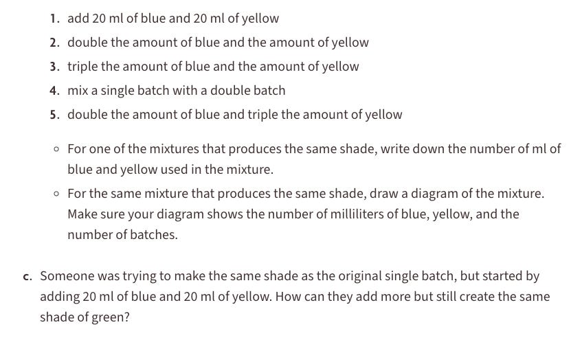
Both have digital elements, and while Example A’s execution is better, that’s not even the sneaky brilliance I’m talking about.
What’s the key difference in the learning from Example A compared to most other curricula?
It’s in how the problems are revealed—one at a time. That simple design choice shifts the entire learning experience. It’s built-in “thin-slicing,” where the tasks get progressively harder, keeping students engaged and nudging their thinking forward, one slice—one screen—at a time.
Furthermore—and this happens all the time—when students are given a full worksheet (digital or not), it’s hard to unsee all the questions. In Example B, part (b) asks students to select from choices 1–5. But then in part (c), they’re told that choice 1 is incorrect. So if students glance ahead, they can just reverse-engineer the answer to part (b) without actually thinking about it.
I can’t tell you how many times I’ve held back a handout—even when I like all the questions on it—simply because I don’t want students seeing question #2 before they’ve finished question #1.
This article is prompting me to reflect on how/when to use the built-in Desmos pacing feature as well.